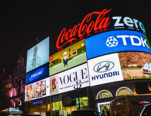
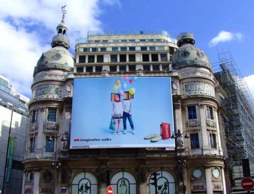
Billboards have always been very important in the world of advertising primarily because of their extensive reach. Just imagine how a single billboard can reach millions of people in a day. This is already reason enough to ensure that the amount you would be spending would eventually translate into meaningful sales conversions. Here are some of the key considerations when creating a high impact design for billboard advertising.
Use a Sensible Story to Deliver a Message
Your billboard design needs to have a story in order for it to be memorable for everyone. To determine which story to use, try thinking about something that you would want viewers to do whenever they see the ad. Do you want them to stop at your next branch and eat some steaks? Do you want them to remember your brand whenever they go shopping for clothes? You can come up with a good and sensible story based on the message you want to deliver.
Stories are important for billboards because people are actually good at recalling them but are bad at recalling facts. As a visual medium, the next thing to do is to find out what text and images to use in order to deliver the story. Being strategic is key when creating a good design. To make an impact, you need to use a fun but short word play. Short rhymes are helpful in making people remember the message. If you need help to find the right story for your next billboard, contact any leading media and marketing professionals in your area for some very reasonable billboard prices.
The Message Should Be Safe and Short
Keep in mind that the billboard will be seen mostly by drivers, passengers and passersby. On the average, they only have around five to 10 seconds to look at the text and design and understand the message. This is the main reason why the message should be kept short. Try to limit the words you will use to only 7 words max.
Ensure Text Readability
With such an enormous layout, it is very important that the design text of your OOH advertising is highly readable. Use a large, bold and clean font for an enhanced readability. By doing so, the viewers can have more time to read and comprehend the message better from afar.
The More Colourful, the Better
In order to draw more viewers in an effortless manner, it can help to include a bold image and bright colours in the design of your billboard advertising. The use of colour contrast can produce an even greater effect and is very helpful in message retention. For the background, it needs to be simple so as not to compete with the foreground for attention. Additionally, the use of a single large photo or image is better in creating a greater impact than the use of several images.


