
Every day thousands of commuters watch the same vehicles glide through their suburb, past the local shops, across the harbour bridge and into the CBD. That repeated sighting is not just background noise; it is a quiet psychology lesson in plain view. For marketers weighing Bus Advertising, the science behind this everyday moment is worth a closer look.
Why repetition breeds preference
Psychologist Robert Zajonc demonstrated that simply seeing the same shape, word or face a few times makes people like it more. The brain rewards ease, so a logo that becomes effortless to process starts to feel friendly. Because the exposure does not need our conscious attention, an ad on the side of a coach can be effective even when we are busy checking the traffic lights. Over time that “this looks familiar” signal turns into “this feels safe”, a subtle shift that lifts brand trust without a single sales pitch.
Buses deliver the right rhythm of exposure
Not all repetition is created equal. The most durable memories form when encounters are spaced out—an idea long known to teachers and, accidentally, to bus operators. Daily services loop along identical routes, meaning residents notice an artwork in the morning peak, forget about it during the day, then notice it again on the trip home. This spacing strengthens memory pathways far better than a one-off billboard near the airport.
For advertisers, a fleet offers scale as well as rhythm. A single contract can send the same creative through business districts, beach suburbs and university precincts, linking the brand to many moments in a person’s week. In practice, advertisers who choose to advertise on bus panels often report higher spontaneous recall than from static outdoor formats of a similar budget.
From likeable to loved: the nostalgia effect
When a design sits in the streetscape for months or years, it moves beyond familiarity. The day the artwork finally comes down people notice its absence—sometimes more keenly than they noticed its presence. That gap can spark nostalgia, an emotion proven to lift mood, ease anxiety and deepen attachment. Brands that have maintained a long-running transit campaign often find that limited “comeback” releases or retro packaging resonate strongly with customers who grew up seeing the original livery on their local run.
Why the medium suits Australian cities
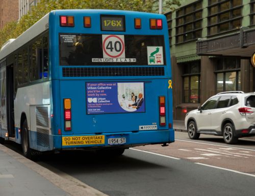
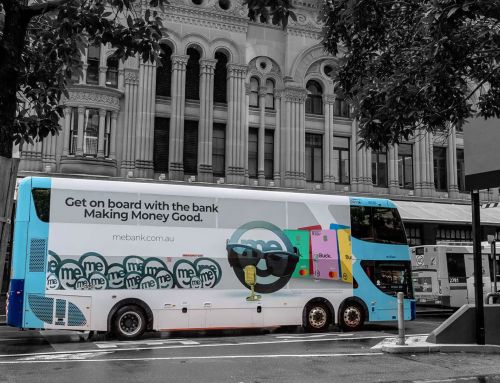
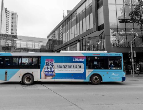
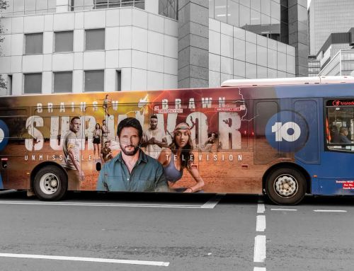
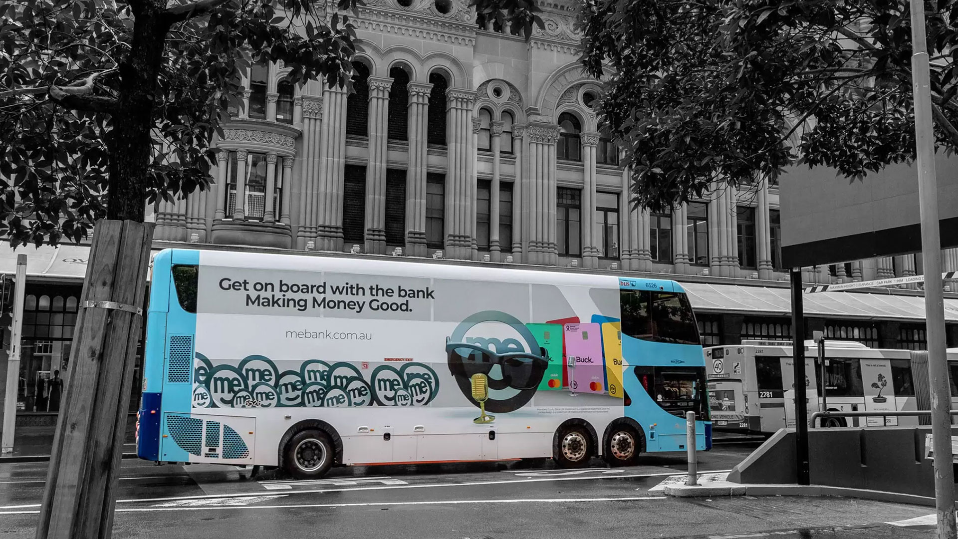
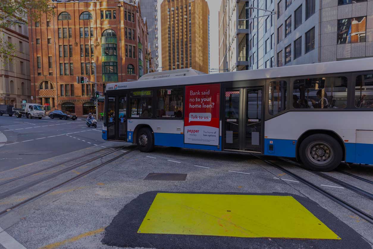
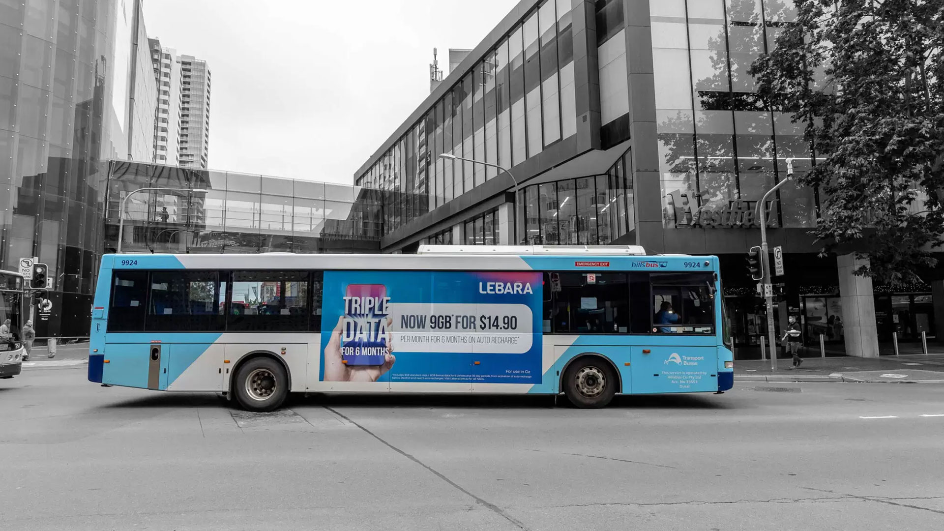
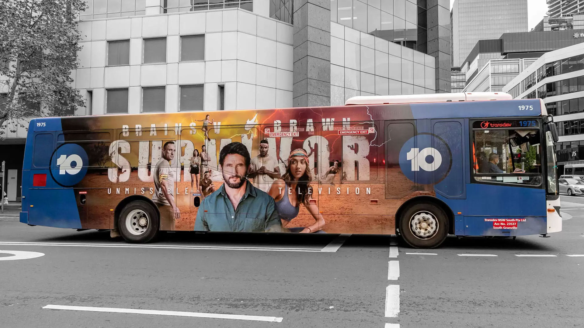
In Sydney, Hillsbus, Transit Systems and a growing number of electric fleets provide canvas after canvas for design. The variety of routes means a single advertiser can reach office workers on George Street, shoppers in Paramatta and surfers heading for Bondi without duplicating spend. Little wonder bus advertising Sydney has become a staple in multi-channel plans aiming to balance reach and frequency.
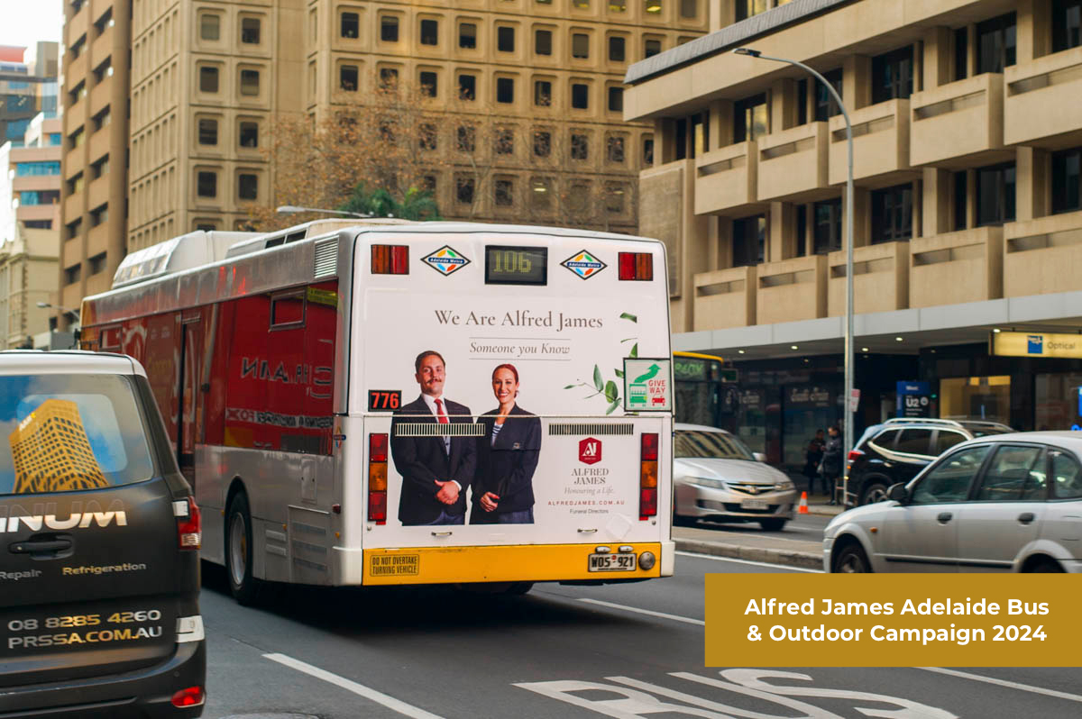
Local context also adds credibility. Because public transport is a trusted civic service, brands that travel on it borrow a slice of that trust. A bank promoting a new low-fee account, a streaming service teasing a fresh drama or a university spruiking mid-year enrolments all benefit from being literally woven into everyday life.
Creative principles that work at street speed
- Keep it simple. Viewers often get three seconds or less. One image, a short headline and a clear brand cue outperform dense layouts.
- Anchor emotion. Instead of listing features, link the product to a single feeling—comfort, excitement, belonging—so the brain can file the message quickly.
- Stay consistent. Colours, typography and iconography should match every other touch-point, accelerating perceptual fluency.
- Refresh without dilution. Rotate a small family of creatives that share the same core assets. Variation prevents boredom while preserving the familiarity dividend.
Budgeting and measurement
Transparent Bus Advertising Rates make planning easier than many assume. Transit authorities publish rate cards, and specialist buyers can negotiate added value such as rear-only takeovers or full wraps timed with events. Out-of-home impact studies suggest that four weeks is the entry point for meaningful lift in unaided awareness, yet a 12-month schedule is where sentiment scores typically jump.
Success is best tracked through brand health metrics rather than clicks. Increases in top-of-mind awareness, favourability and purchase intent tell a clearer story than QR scans alone. That said, pairing geofenced mobile surveys with panel locations can reveal handy directional data.
Thinking beyond the bus
Planners often weigh rolling stock against shelters and street furniture. When comparing Bus Shelter Advertising rates Sydney to mobile panels, remember that the formats serve different cognitive jobs. Shelters capture a captive audience for longer, suiting detailed creative, while buses excel at delivering high-frequency, low-involvement impressions across a broader geography. Used together they create a one-two punch: depth plus reach.
Turning familiarity into a future asset
A well-timed exit can be as powerful as the campaign itself. Once a message has lived on a route for years, briefly retiring it allows nostalgia to do its work. The brand can later revisit the artwork—perhaps on a limited edition product run or a social post celebrating “the ad that rode with Sydney”. Consumers who remember the design from their school commute are now professionals with spending power, and the fondness built back then still lingers.
All in all, public transport might not shout like a prime-time television spot, yet its whisper is persistent and persuasive. By aligning with the natural rhythm of daily travel, bus advertising converts fleeting glances into long-term memory, and later, into warm recollection.

