
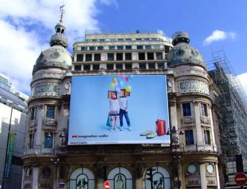
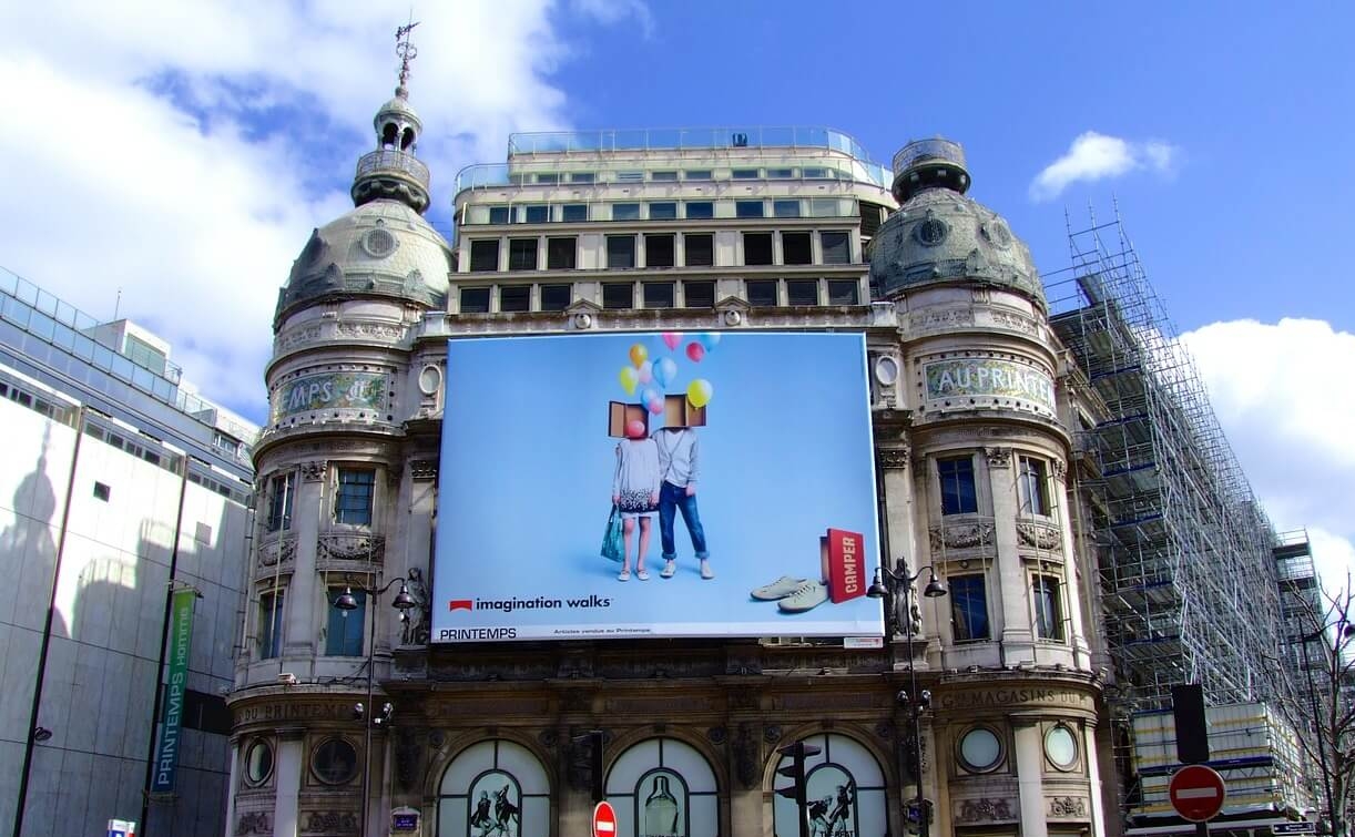
Anamorphic outdoor work lives or dies by its lighting. It’s what gives life to any visual object. The image may be flawless on a designer’s screen, yet it only convinces on the street when light and shadow agree with the viewing geometry. This blog outlines practical methods that creative teams, media buyers, and site operators can use to make depth read instantly, whether the asset is static print or a digital screen.
Why Are Lights and Shadows Crucial To 3D OOH?
Studies show that internally illuminated signs can extend nighttime legibility by 40–60% compared with external floodlights, while well-set nighttime brightness reduces the daytime advantage to around 13%, a reminder that lighting quality, not just quantity, determines whether a 3D illusion is readable at a glance.
- Legibility and Speed: Correct lighting lifts contrast so viewers decode the image in a split second, even at driving speeds.
- Depth Perception: Cast shadows and highlights provide the brain with reliable depth cues, turning flat artwork into a convincing spatial scene.
- Form Definition: Shadow edges separate overlapping elements, preventing visual muddle and preserving the illusion’s structure.
- Real-World Coherence: When billboard shadows align with ambient light, the creative feels “believable”, reducing the risk of the effect collapsing.
- Day–Night Consistency: Balanced luminance keeps shapes readable after dark and avoids glare that washes out 3D detail.
- Attention Capture: Strong, directional light creates focal points that guide the eye to the hero object or message.
- Photographability: Clean highlights and anchored shadows produce clearer phone photos, boosting social sharing and earned reach.
These principles apply across billboard advertising, from large-format spectaculars to street furniture.
How to Make 3D Billboards Look Real with Lighting Techniques?
Sightlines and The Sweet Spot
Every 3D illusion has a sweet spot where perspective lines converge convincingly. Survey it first. Record viewer eye height, approach speed and the angle of attack.
In city centres, the sweet spot may sit ten to fifteen metres back along a footpath; on elevated sites, drivers sight the board from below, so vertical compression becomes vital. Anchor the artwork to a real-world reference at that vantage point: a virtual object resting on a ledge or intersecting a pole helps the brain accept the depth cue.
Where foot traffic splits across two approaches, build two micro sweet spots by averaging angles and simplifying forms. For teams planning billboard advertising in Sydney, sightline checks are even more crucial due to the narrow streets and varied elevations.
Day Versus Night Setups
Daylight brings hard shadows and shifting colour temperature; night introduces screens, luminance caps and spill from streetlights. Plan for both. If the site is digital, set distinct day and night playlists with adjusted gamma and blacks.
At night, slightly lift mid-tones to avoid a banner of pure black that disconnects from the streetscape. For static print, create a gentle fill with lighter shadow cores to ensure the image remains visible on overcast days. When you advertise on billboard networks with mixed orientations, request photometric specs in nits and ask for a recent site photo taken at dusk to judge competing light sources.
Shadow Craft: Ratios, Fall-Off and Anchoring
Shadows do more than outline form. They anchor objects to surfaces and signal distance. Aim for a clear hierarchy: a primary key shadow with a defined edge near the “contact” point, and a softer secondary fall-off that fades into the background. Keep internal cast shadows consistent with the imaginary light source.
If your hero element appears to protrude, paint a faint occlusion shadow on the billboard face where the object emerges. That single cue often doubles perceived depth. Avoid pitch-black holes; street environments rarely hit absolute zero luminance, and pure black shouts “fake”.
Weather and Season
Australian conditions swing from harsh summer sun to low winter angles and rain glare. In bright summer, specular highlights can wash out fine edges; build slightly thicker contour lines and push mid-tone contrast.
Winter’s lower sun throws long, real shadows across the board; test the artwork at those times so virtual shadows don’t contradict nature. Rain helps and hurts: wet roads reflect screens and lift ambient light, which softens shadows but can boost legibility. Prepare a wet-weather cut with reduced micro-detail for digital sites.
Static Print Versus Digital Screens
Static assets rely on painted gradients, hard-edge masks and photographic textures to simulate light. Pre-press matters: request a paper proof under a D50 light booth and a scaled vinyl test outside under natural light. On digital, movement tempts designers to overdo parallax. Keep motion small and purposeful.
A slow, directional highlight sweep or a gentle shadow shift tied to real-world time is enough to breathe. If you need exact Billboard Advertising Rates before committing to dynamic versions, consult the agency and compare the premium for DOOH time slots against static buys. Many teams benchmark billboard advertising Sydney cost during budgeting to ensure the creative ambition matches the media spend.
If you’re weighing whether your budget is right for a board at this stage, this guide walks you through timing and location rules of thumb.
Quality Assurance Checklist
- Capture phone videos from the actual approach path at typical eye height.
- Print at 1:10 scale and review outdoors; small mock-ups reveal banding early.
- For digital, validate colour management on the live controller, not just the studio monitor.
- Stand in the secondary vantage and check whether depth collapses; if it does, simplify the form.
- Confirm that luminance settings meet council or operator caps to avoid forced dimming that flatten shading.
- Ask the installer for final photos at morning, midday and dusk; keep a backup creative with adjusted shadow density if the site reads flatter than planned.
Mini Case Notes
A CBD facade with heavy lunchtime footfall needed the illusion to resolve within three metres. The team sculpted a pronounced contact shadow directly under the hero object and added a faint reflected highlight on the “floor” plane to tie the asset to the sandstone wall behind it.
The result held up from oblique angles and drew crowd shots without blocking the footpath. On a coastal arterial where drivers view from below, the art used compressed verticals and a gradient that darkened toward the lower edge; the object appeared to hover safely above the sign frame, even at speed.
Operator Collaboration and Compliance
Strong 3D reads rely on close cooperation with site owners. Ask for a recent photometric report, daytime and evening calibration logs, and any auto-dimming schedules that might affect contrast at peak times.
Request maintenance windows in advance so playlists can be tested on-site, not only in pre-flight. If the location is near traffic signals, ensure animated highlights do not mimic red or amber cues. In dense precincts typical of billboard advertising in Sydney, align the creative with nearby façades and street furniture to avoid visual clashes that flatten perceived depth.
Bringing It All Together
Lighting and shadow are not final touches; they are the structure that sells depth. Start with the site’s real light, set a consistent imaginary key, and defend that decision across every asset and playlist. Match geometry to the sweet spot, split day and night treatments, and keep a rapid-response file for weather or operator constraints. These habits lift 3D concepts from interesting to convincing, and they travel well across formats and cities.
Wrapping Up
Planned alongside placement and buying windows, they give outdoor work the best chance to stop passers-by, drive shares, and support the brand outcomes that brought the campaign to the street in the first place.
For expert planning, cost guidance, and access to premium outdoor locations, contact Best Media Rates. Our team can help you align creative, lighting, and placement for maximum impact.


