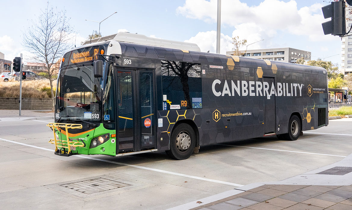
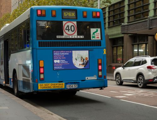
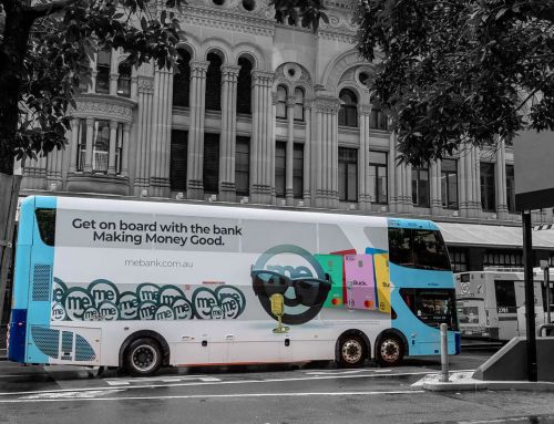
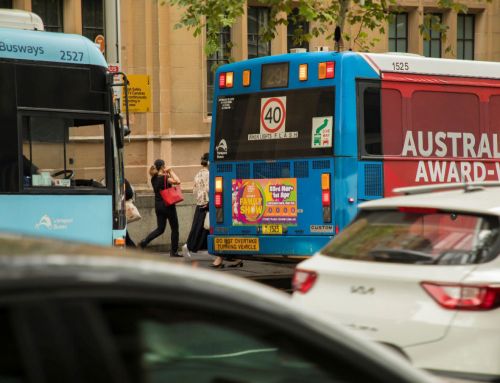
Buses move, sightlines shift, and the audience often sits in traffic or waits at a stop. That leaves a narrow window to land a message. Three seconds is a practical yardstick: long enough to catch a bold line, a logo, and one reason to act.
Why three seconds?
What can a viewer take in while a bus rolls past at about 40 km/h? A short headline, a single visual cue, and a clear sender. Anything more to out of home advertising risks blur or clutter. So the aim is simple: reduce the cognitive load and help recall. That means fewer words, stronger contrasts, and elements that scale from six metres to thirty.
The five layouts
1) The Big Benefit Bar
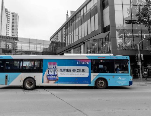
Use a full-width band along the superside with a five to seven word promise, set in heavy type. Put the brand mark at either end, and place a short call to action beneath it. Best for price, speed, or convenience claims. Keep supporting text off the moving panel to avoid microcopy that nobody reads at pace.
2) Number + Noun Punch
Lead with a large numeral that signals scale or saving: “24/7 Support”, “$59 Plan”, “10-Minute Setup”. The eye finds numbers fast, and they compress meaning. Add a single noun after the number, then the brand. This format suits short offers, but it still works for category leadership lines when the numeral stands for rank.
3) Product-as-Icon
Turn the product or pack into a hero icon and anchor it to a flat colour field. One short line sits above or below it. The image does the heavy lifting while the line supplies context. Many FMCG, telco, and app brands win with this because shape and colour carry recognition from far away.
4) Two-Word Command
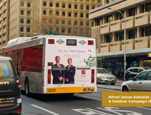
One verb and one object. “Switch Mobile”, “Book Now”, “Try Fresh”. Then a logo large enough to read across a lane. This layout thrives on the bus rear where drivers stare at the vehicle for longer at lights. It also minimises waste on smaller side panels where space is tight.
5) Social Proof Badge
Build a roundel or ribbon that states a rating, award, or user count. Pair it with a short benefit line. The badge provides a focal point and signals credibility. Use high contrast so the shape reads clearly against the livery and street background. This format helps new brands borrow confidence without drowning the viewer in copy.
Quick comparison
| Layout | Ideal word count | Best placement | Works best for |
| Big Benefit Bar | 5–9 | Superside, full wrap | Value or speed claims |
| Number + Noun Punch | 2–4 | T-side, superside | Offers and plans |
| Product-as-Icon | 2–5 | Superside, full wrap | Pack recognition |
| Two-Word Command | 2 | Rear, mega rear | Direct response |
| Social Proof Badge | 3–6 | Side with clear space | Trust signals |
Type, colour, and composition that pass the test
Keep the type hierarchy strict: headline first, logo second, CTA third. Use one strong typeface in a heavy weight so counters don’t fill in at distance. Favour sentence case for easy scanning. Avoid italics and thin weights. Contrast beats colour trends: dark type on a light field or the reverse. A limited palette holds together across changing daylight and shadows.
How big should letters be? There is no single magic ratio for every street, but bigger always helps. Prioritise the largest words and let less important text drop. Many campaigns work well with a headline that occupies at least a third of the panel height. If you must include legal lines, stack and shrink them, and place them where they won’t compete with the headline.
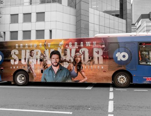
Photography demands restraint. Close crops win. Faces should look out toward traffic rather than into the bus body. Avoid busy backgrounds that merge with city clutter. When in doubt, use a flat colour field or a simple gradient so shapes pop.
Placement choices that match dwell time
Side panels favour the quick scan during motion. Rear panels suit short commands when vehicles stack at lights. Roofline elements and wheel-arch areas carry less weight because they break up words and images. Test artwork on a real bus template, then print at scale to check legibility from different distances.
Will a single message work across all formats? Yes, if you adapt. Keep the core line and swap the composition. For example, run the Big Benefit Bar on the side and the Two-Word Command on the rear, both in the same colours and type. Consistency builds recall without forcing one layout into the wrong space.
From artwork to buy: practical steps
Before you place an order, map the campaign to real routes and sightlines. A bold rear on commuter routes can outperform a busy side panel in a quieter area. Creative and media should talk early so the layout meets the street, not just the brief. This matters for outdoor advertising of any size and budget.
Budget planning also benefits from clarity on scale. Buyers compare price against reach and dwell time, not just unit cost. Keep notes on which formats match each objective. That helps you defend the spend when procurement asks about Outdoor Advertising Rates and delivery.
Local context counts. High-traffic corridors near Parramatta or the CBD have dense visual noise, so bigger type and simpler layouts win. Brands running outdoor advertising Sydney wide should align colour choices with the city backdrop. Greys, glass, and concrete swallow low-contrast art.
Proof that it worked
Set clear metrics. Track direct responses with short URLs or unique QR codes placed near the logo, not in a corner. Measure lifts in search and branded traffic by route and week. Pair that with field photos and short intercept surveys. The mix shows both behaviour and recall.
What should a brand do if results look soft after week one? Rotate creative across the five layouts rather than rewriting the line. The message stays the same while the composition shifts. This keeps learning focused and avoids wasting print.
Final creative checklist
- One idea only: benefit, number, icon, command, or badge
- Five to nine words at most
- Heavy type, high contrast, limited palette
- Logo large and clean
- Short CTA near the brand mark
- Simple image or none
- Adapt layout by panel, keep the system consistent
These layouts give outdoor advertisers a straightforward playbook that respects how people read moving objects. The goal is not art for a portfolio. It is clarity in motion, delivered at street speed, and bought smartly inside a wider program of outdoor advertising that works across a city and a quarter.

