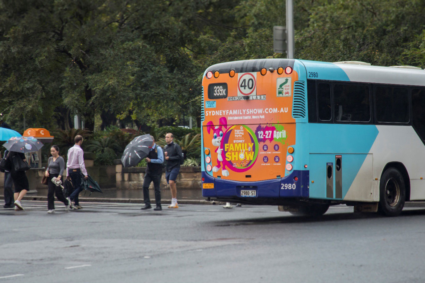
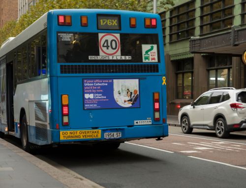
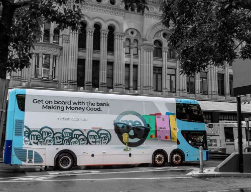
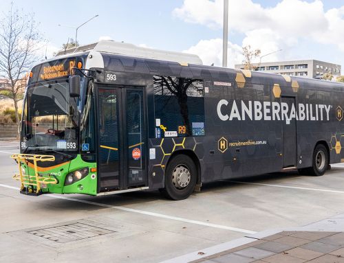
When a bus hurtles past at 50 km/h, viewers have mere seconds to absorb its messaging. That brief window makes high‑contrast colour schemes indispensable for any campaign aiming to advertise on bus exteriors or interiors. By understanding how motion, light and colour perception interact, brands can craft bus wraps that seize attention and deliver legible content even at speed.
The Science Behind Contrast on Moving Vehicles
Colour contrast hinges on luminance differences between foreground and background. On stationary billboards, a ratio of 4.5:1 (dark text on light background or vice versa) often suffices. However, once a bus is in motion, the human eye registers mid‑tone shifts and motion blur. Bright sunshine has a knack for bleaching out subtle contrasts, while after dark the glare of street‑lights and oncoming headlights can drain the punch from even the boldest inks. Stick with the dependable pairings—black on yellow, white on deep navy—so your message cuts through as the scenery whips past. Curious about how bus ads pull focus, build brands and nudge people to act? Take a look at our guide.
Choosing Optimal Palettes for Bus Wraps
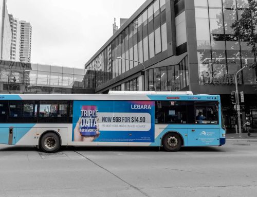
Designers should prioritise palettes proven to withstand glare and motion. A classic choice is a deep navy field with white lettering, which offers strong luminance contrast without overwhelming the viewer. Alternatively, a high‑visibility yellow base with bold black text can command attention, especially in urban settings. When you choose Bus Advertising packages, ask your provider for colour‑contrast proofs under simulated motion conditions. That extra step confirms your design won’t lose clarity when the bus swings around a corner.
Typeface, Size and Layout Considerations
Colour alone won’t save a campaign if type is too small or cramped. At 50 km/h, a bus covers almost 14 metres per second. If viewers first glimpse your design from 60 metres away, they have roughly four seconds to read and process it. Use sans‑serif fonts with open counters—Arial, Helvetica or Montserrat—to maintain crisp letterforms.
Make your main headline big roughly 200 mm high and give every character a generous 100 mm of breathing space. Paired with a strong colour contrast, that room to breathe means the message pops in the fraction of a second a passing driver has to read it.
Incorporating Borders and Shadows
Buses roll through all sorts of backdrops, including CBD skylines, leafy backstreets, even coastal stretches where sunlight bounces off the water. To keep your copy from disappearing into that visual chaos, give it a bit of insurance. Add a skinny dark border around white letters and they won’t disappear against murals or crowded footpaths. For dark type, swap it. Consider adding a faint pale glow so the words pop out of the shadows. Small tweaks like these keep copy clear without hogging attention.
Local Insights: Bus Advertising in Sydney
Sydney’s streets are loud—visually, anyway. Storefront signs, LED boards and tower‑high banners all jostle for a commuter’s attention, and the weather swings from blinding sunshine to sideways rain without much warning. If you’re considering bus advertising in Sydney, team up with someone who knows the local conditions. A seasoned planner will flag routes where matte finishes cut harsh lunchtime glare, and spots where reflective vinyls keep colours glowing long after the street‑lights click on.
Budgeting for Colour Performance
Top‑shelf inks and smart coatings don’t come for pocket change, yet they usually pay their own way. Reflective or fluorescent pigments make the wrap pop after dark, while UV‑blocking layers keep colours lively long after the job leaves the printer. So, when you’re sizing up Bus Advertising Rates, think beyond the upfront cost. Spending a little extra on print quality often means the artwork stays sharper, sticks in people’s minds longer and saves you forking out for a fresh wrap month down the track.
Planning for Bus Shelter Advertising
Bus‑stop posters get a little more love time than a flying bus wrap, but they’ve still got quirks of their challenges. A street‑lamp can cast a yellow haze, a faulty lightbox might leave corners in shadow, and the backdrop might be a mish‑mash of bricks, glass and tree branches. Stick to the same high‑contrast rules you’d use on a moving bus, and your artwork will still stand out in that visual jumble. When you’re checking bus shelter advertising rates Sydney, make sure the deal covers basics like regular cleaning and light maintenance—grime or a blown bulb will kill contrast faster than any design mistake.
Testing and Quality Assurance
Testing is the key. Install mock‑up graphics at representative locations and observe how they perform under various lighting and weather conditions. Grab a quick video while the vehicle cruises by at normal speed, you’ll spot any blur or colour fade straight away. Schedule follow‑up inspections every three to six months to identify any fading or damage. Quick touch‑ups or replacements ensure your campaign remains crisp and impactful throughout its run.
Put Your Brand in the Fast Lane
Securing attention at 50 km/h takes more than a catchy slogan. High‑contrast colour, disciplined typography and ongoing care turn a passing bus into a billboard the public can actually read. Best Media Rates pairs data‑led planning with keen buying power to place your brand on the right routes, at the right price, and with creative that stays sharp from the first kilometre to the last. Reach out today and let’s get your message moving.

